BRIEF
Redesign Vionic Shoe's visual identity into a modern, fashionable, wellness-oriented brand while still staying true to the science behind Vionic Shoes. Increase engagement and sales to 30-40 year old female demographic.
SOLUTION
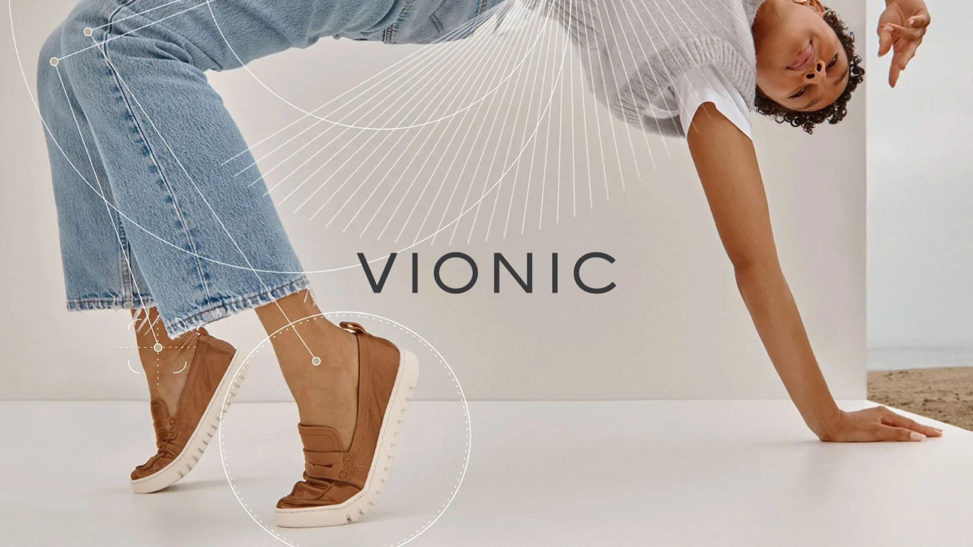
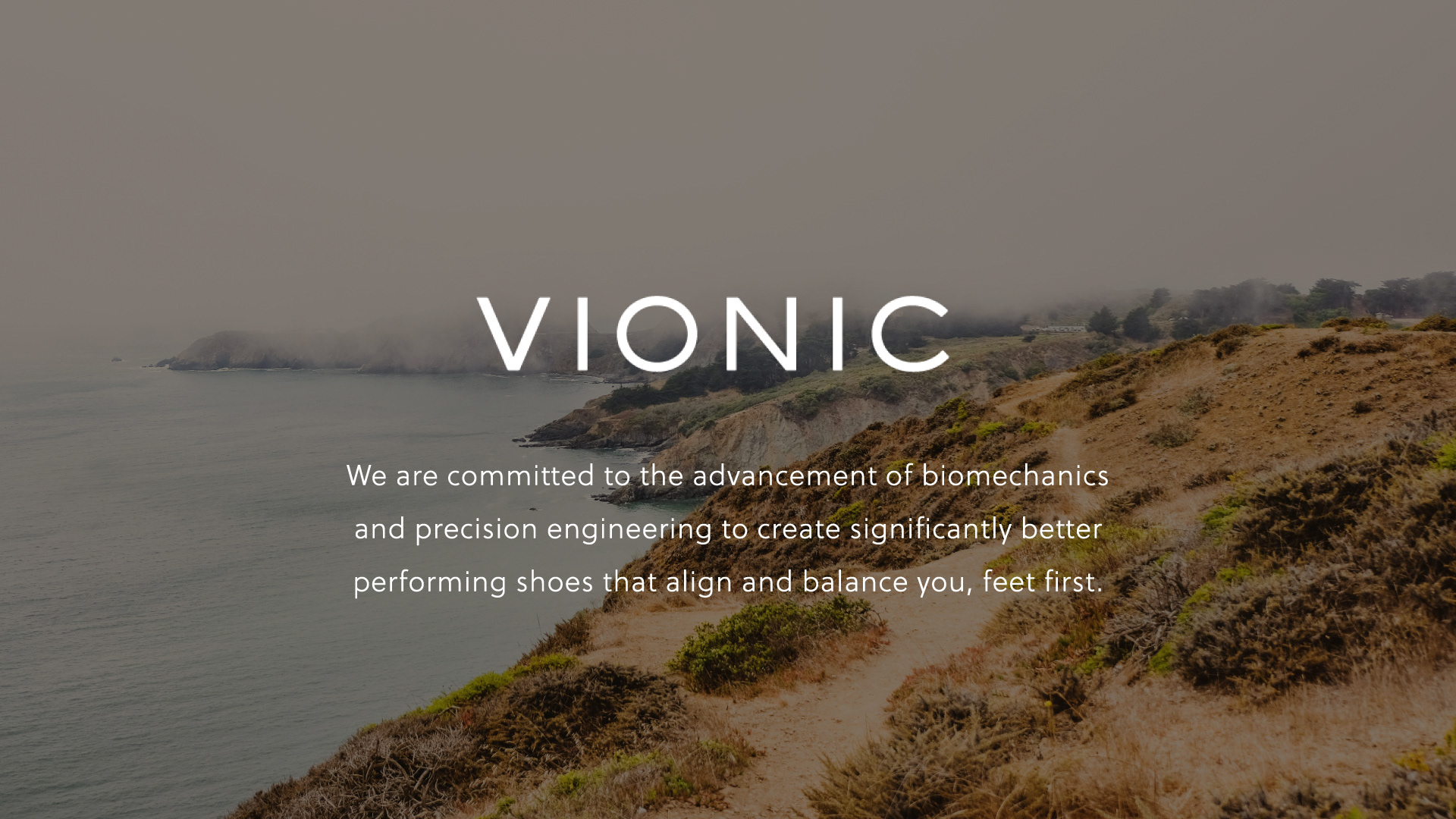
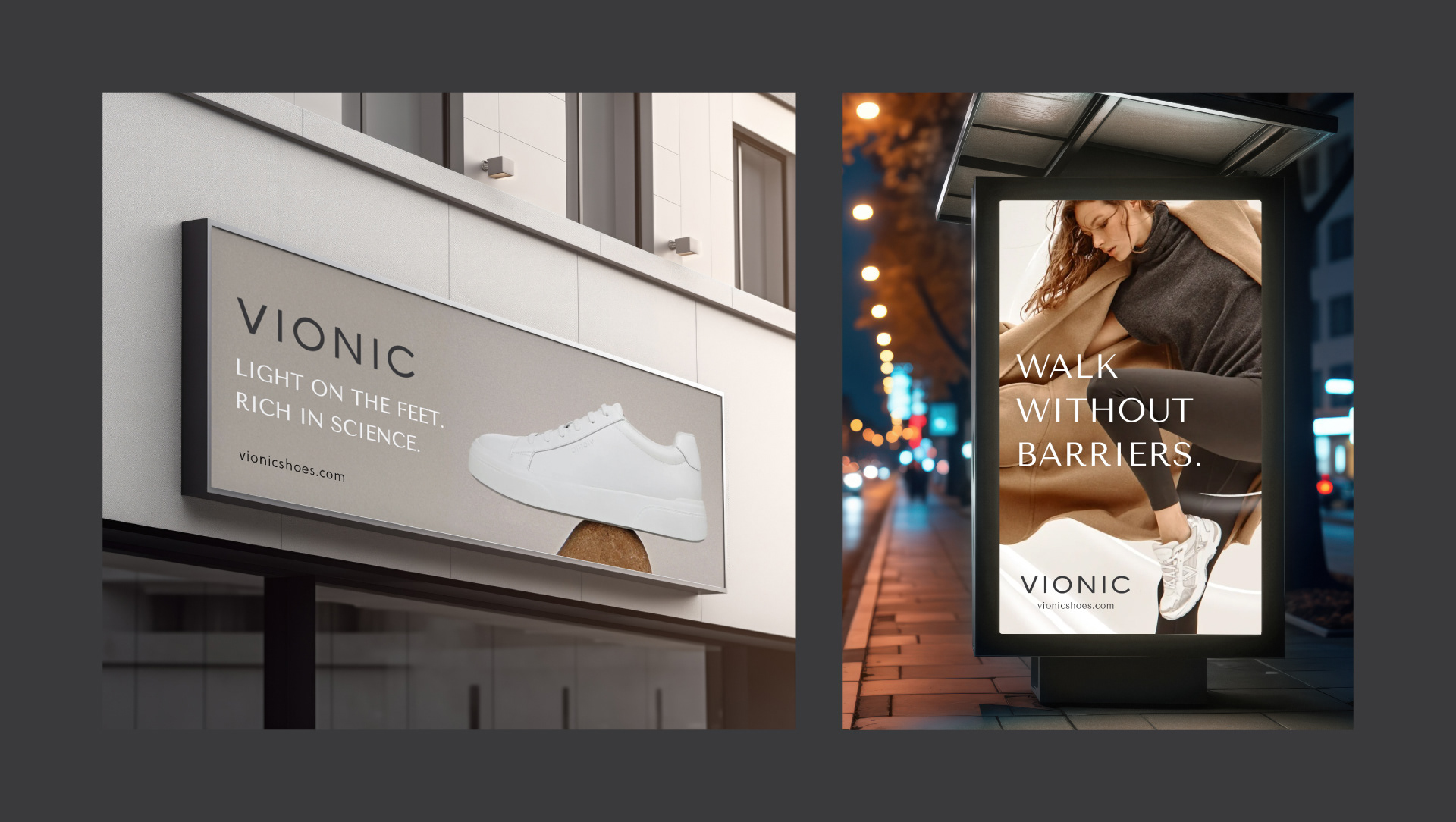
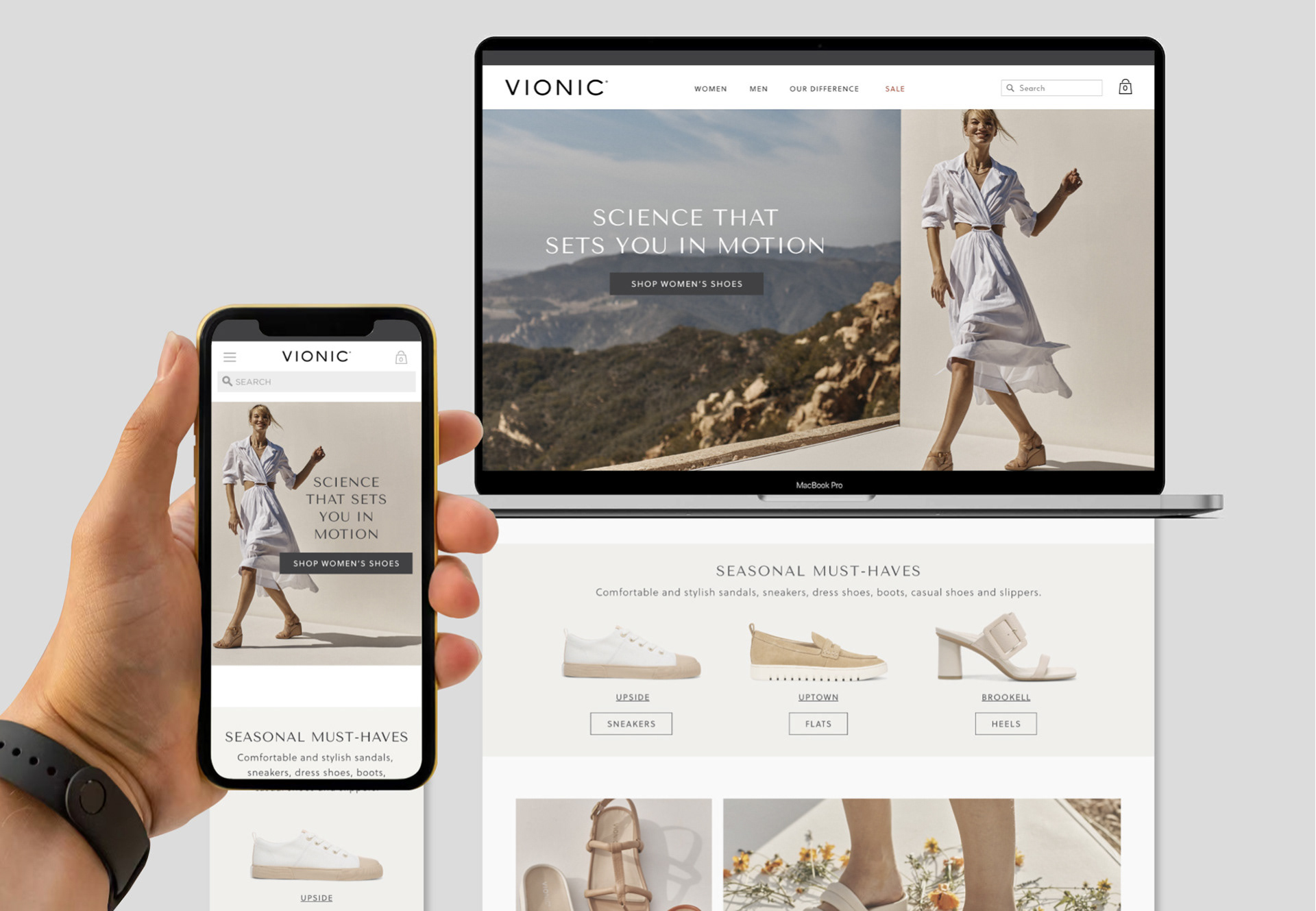
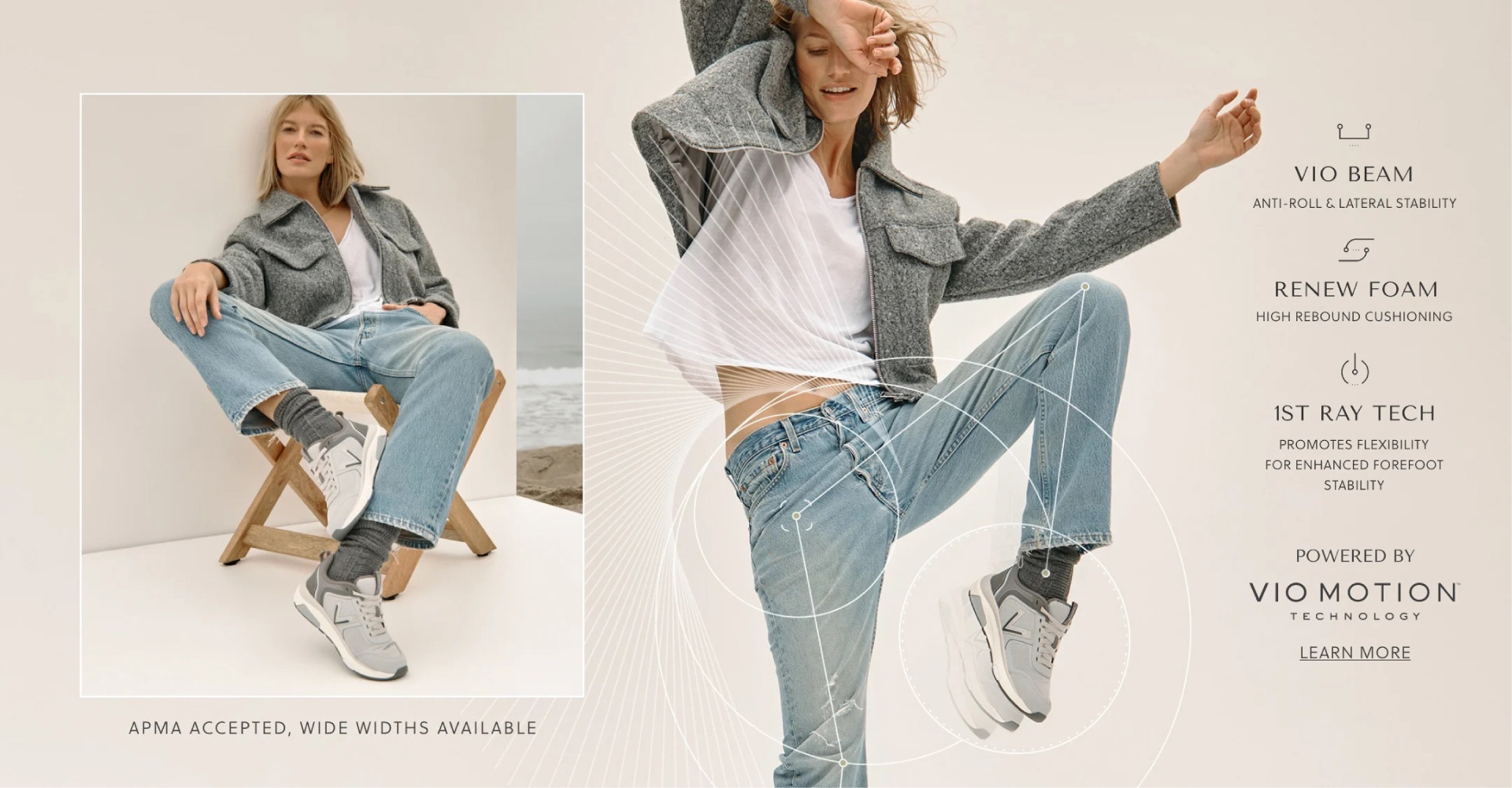
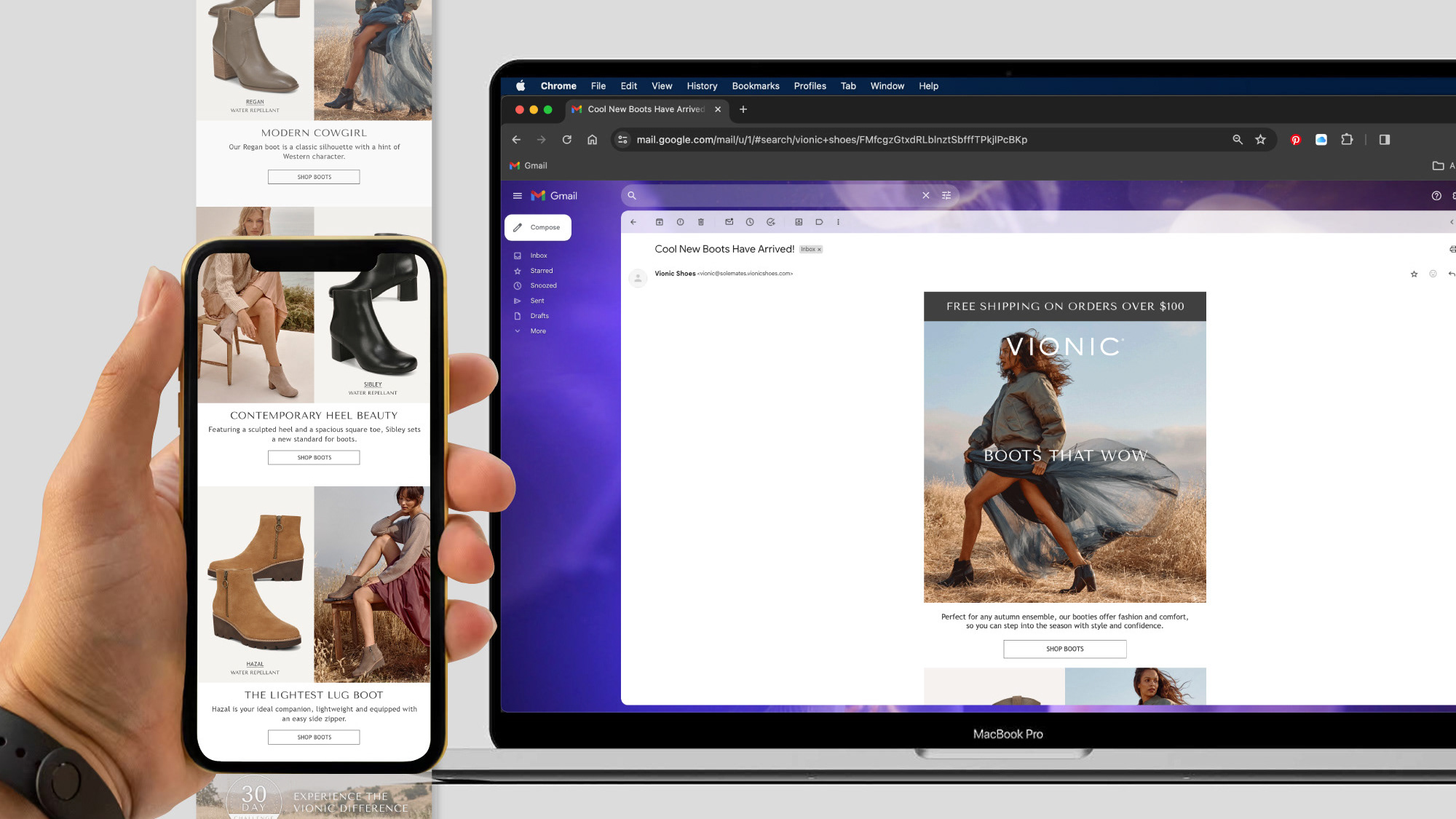
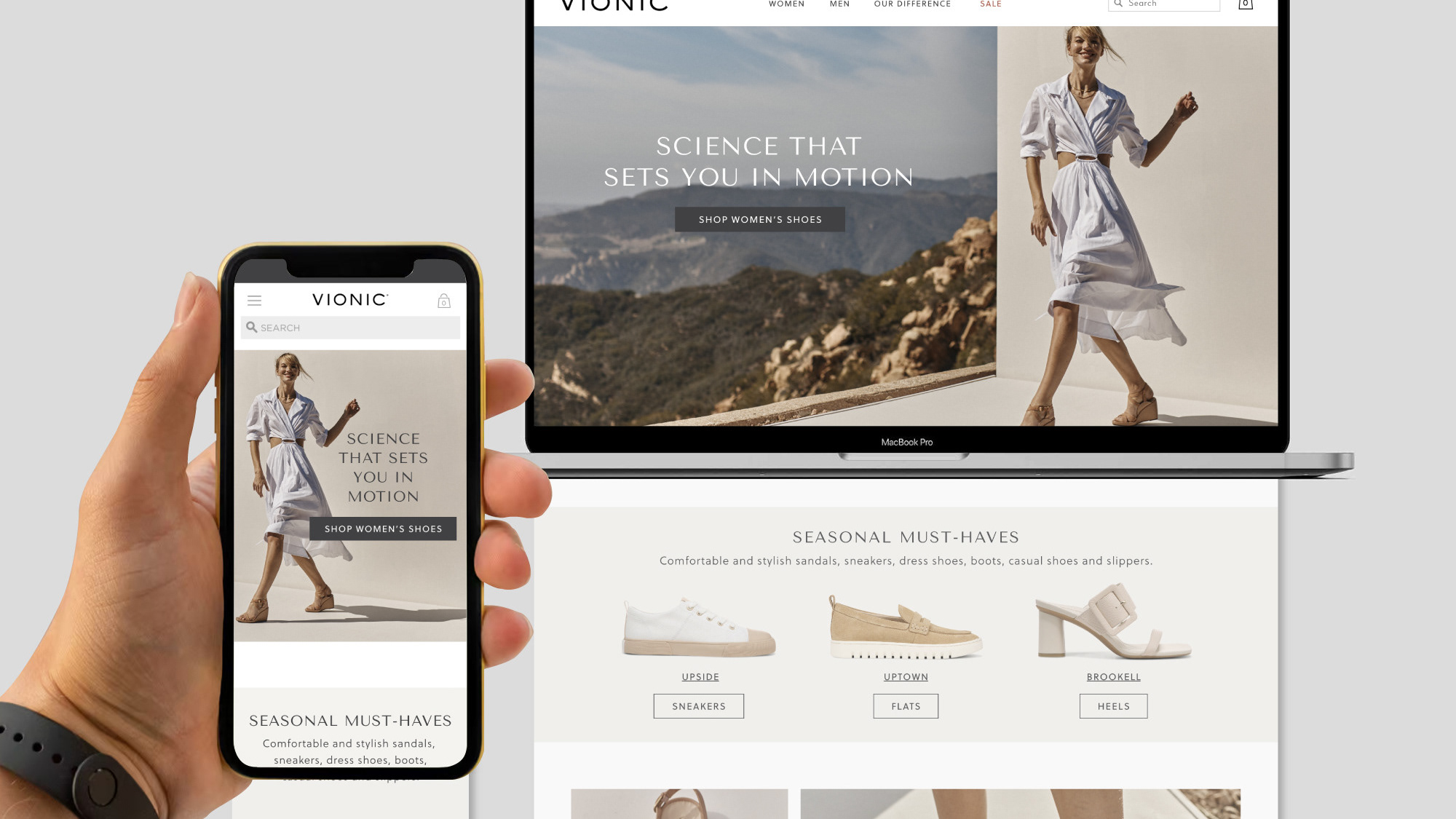
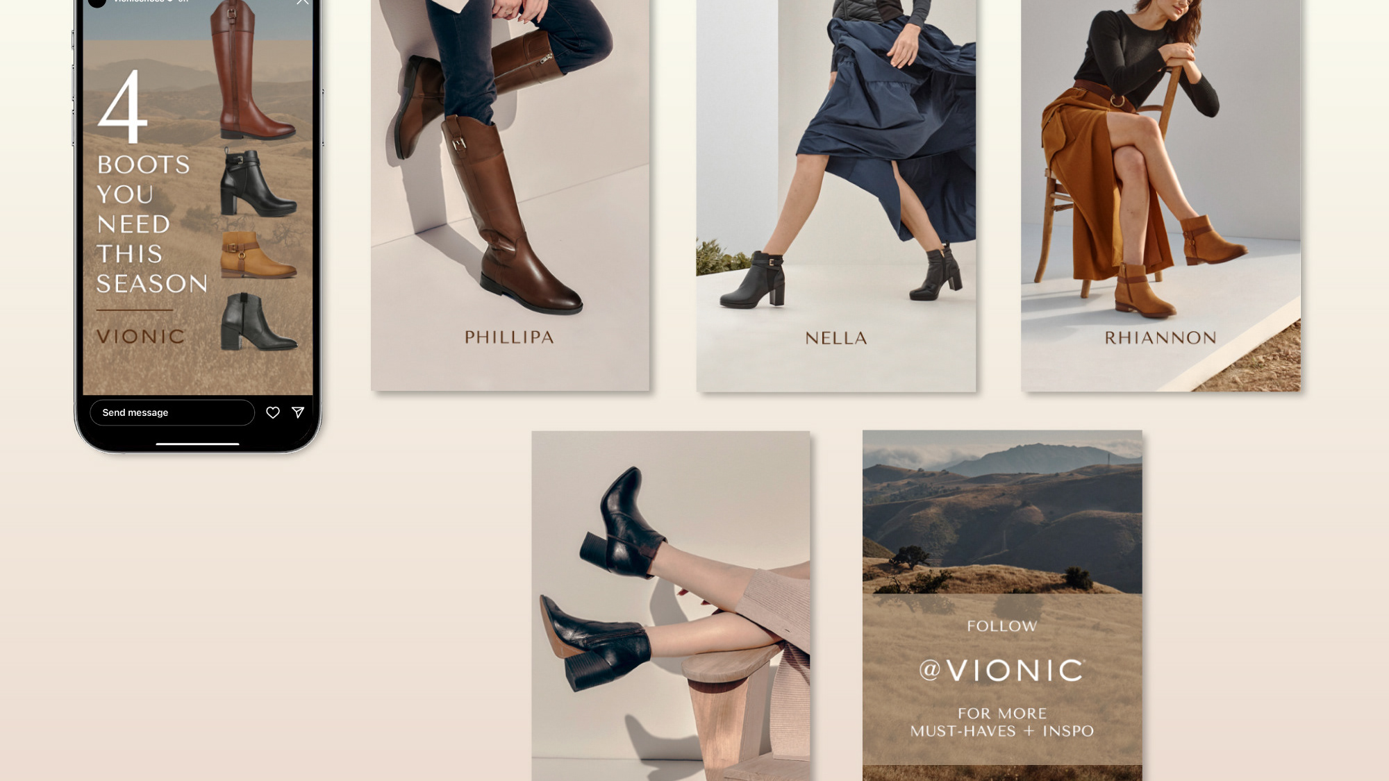
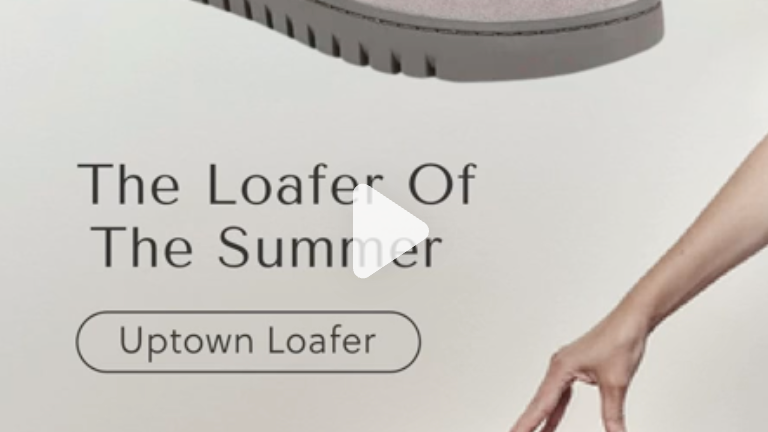
With it's history as Orthaheel, Vionic had been known for its comfortable orthotic footwear, but had failed to reach a younger audience despite it's name change in 2014. Working alongside the creative director in January 2023, we focused on fashion-forward photography with laid-back Californian aesthetics to serve as the foundation of improving our creative assets.
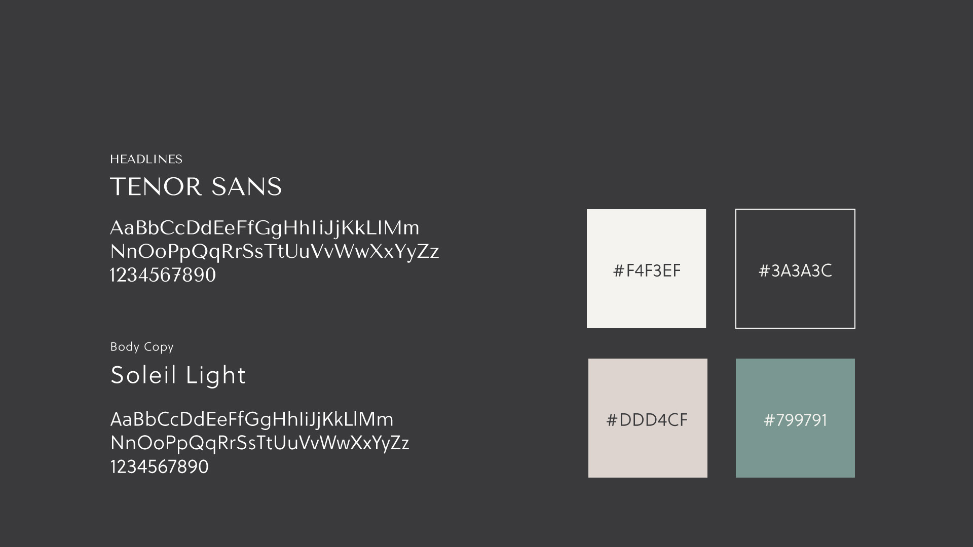
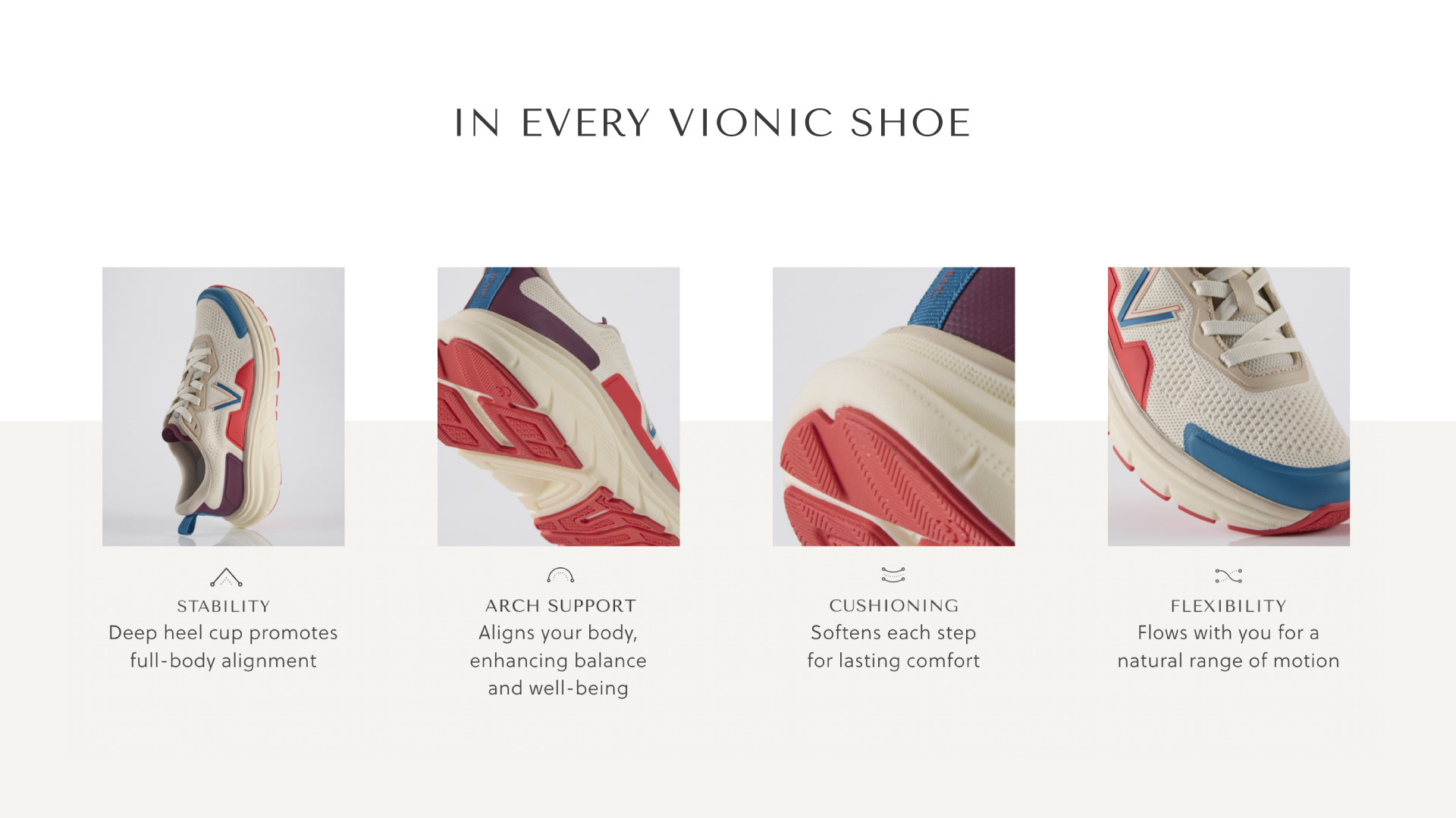
Models were directed to move dynamically to highlight the comfort and biomechanics of Vionic's stylish, supportive shoes. Thus came the development of our biomechanic line drawings to underline the impact that biomechanically designed footwear has on one's overall well-being. We updated our brand typography to Tenor Sans and Soleil, two fonts that evoke wellness, elegance, fashion, and simplicity. I partnered with our copywriter to ensure a consistent brand voice that was mature, peaceful, and succinct with a more youthful syntax.
RESULT
The launch of the rebrand led to a clear growth in our target audience, with a 12% increase in 30-40 year old women. While the brand's customer is still predominantly women over 50, Vionic's new visual presence has seen a 30% increase in engagement with the target demographic via organic and paid social which is directly attributed to its new look and feel.